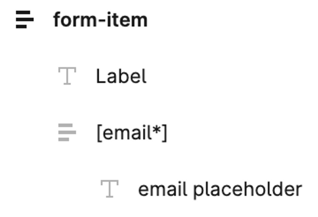
Each form field can have different configuration settings. If a form field requires a label, it should be presented in a frame containing text describing the field and the input field itself. If a label is not required, it is sufficient to display only the input field.


The input field is a frame that is located inside the form, and its name should correspond to the type of input field. The available types are text, email, url, tel, password, select, acceptance, number, date, and time. The type of the field should be enclosed in square brackets. If you include an asterisk in the name, the input field will be mandatory.
The width of the elements is set in percentages and can be chosen from the following options available in Elementor: 20, 25, 30, 33, 40, 50, 60, 66, 70, 75, 80, and 100.
Within one form, all fields should have the same size, which can be one of the following values: xs, sm, md, lg, or xl. Elementor calculates the average height of all input fields in pixels, and if the average height does not exceed 33px, the size is set to “xs”. If it is less than 40px, the size is set to “sm”, if it is 47px, the size is set to “md”, if it is 59px, the size is set to “lg”, and if it is 72px or more, the size is set to “xl”.
The vertical and horizontal margins within the form should also be set to the average values.
The submit button’s height is calculated in a similar way to the input fields’ height.
Different input field types:
- text, email, url, tel, number, date, and time. Any text included inside the input field will be displayed as a placeholder.
- checkbox. Each text element inside the checkbox represents a separate option.
- acceptance. Any text included inside the input field will be accepted as the agreement description.