In Fignel, the main frame is used for layout integrity.
The width of the layout is often predetermined and set to a fixed value, while the height is determined dynamically using the HUG method.
In Figma, the frame width can be set in several ways:
- FIXED
- HUG
- FILL
Elementor supports setting the container in absolute or relative values. The width that adjusts to the content (HUG) can only be implemented with custom CSS styles, so when transferred, HUG is defined as FIXED and exported in pixels.
If the container is set to FILL mode, the width is calculated as a percentage relative to the width of the parent container.
Therefore, if you need columns of the same width for all screen sizes, you should use FILL width for the inner containers.
It is possible to combine columns with different width types. In this case, columns with a fixed width will retain their size, while columns with FILL will shrink or expand when the screen size changes relative to the template's base width.
Example:
We have a layout:
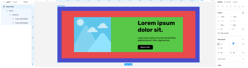
When exporting the layout, the size of the main frame will be omitted.
The width of the template in Elementor is often set to 100%, but it can be limited by the styles of the main theme installed on your WordPress site.
If you need to limit the width of your layout, you should use sections with a fixed width. Otherwise, the layout will try to occupy the entire width.
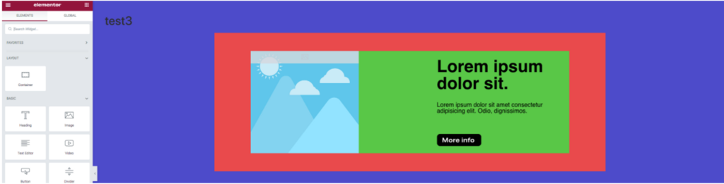
Template with a container using a fixed width:
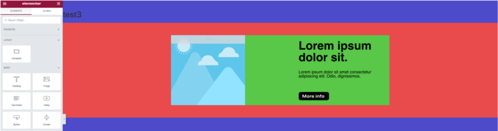
When using FILL width:
When laying out content, you should consider how the content should respond to changes in screen size. If the content has a fixed width that should not change regardless of the screen size, use FIXED. If you are still unsure about the content and are designing the layout, you can use HUG. But if the content should proportionally change its width, then use FILL.